NOTE: This is some user feedback I recently sent to IFTTT‘s CEO per his request on Product Hunt. I love their service, I just wanted to point out some places that this redesign might have missed the mark. Despite these niggles, their redesign was much needed and I believe quite successful, these are just some suggestions of how it could be even MORE successful. If you’ve never used their service, I highly recommend it.
Redesign
The redesign looks nice, but seems like mobile-first has translated into mobile only. What I mean by this is that some designers labor under the false impression that “simple is better” and that a design that works on mobile will be suitable for desktop. The problem is that the condensed and simple nature of a mobile design doesn’t translate well to desktop, and can often decrease usability of the desktop site [3]. In fact, Nielsen Norman Group estimates that less than 40% of desktop screen size is utilized (and that was in 2013!) in modern website design [1]. They talk extensively about the content-to-chrome ratio, or the ratio between website content and UI options (chrome), in this article which is a fantastic read even for non-designers. Stupid statistics aside, some of the “largeness” of the home page and other pages, including header and navigation, screams “not optimized for desktop” to me. Also the usage of “Tap for [action]” instead of “Click” just reinforces the idea.
Home Page
After logging in or signing up, the first thing a user is presented with is the applet discover page. For new or returning users, you are making the assumption that they read the home page and understand what applets are, or that they are familiar with your service already. This might be a fine assumption to make for new users depending on your signup funnel, but after a UX redesign not explaining the changes or what the terminology means to existing users is a misstep. Even new users might sign up assuming there will be onboarding or other startup documentation, and be left a bit in the lurch when landing on this page. I recommend providing some sort of onboarding with some definitions of terminology or even provide a default applet (perhaps notifying users of new blog posts on IFTT?) for users to play with.
Discover Applets Page
The discover page doesn’t visibly have anything close to an option to “Create”. Sure, there are recommendations for me, but what happens when I click on these boxes? Do I get more information or do I need to sign up for something? What happens if I don’t want any of these recommendations but would rather create my own? It’s unclear to me, as a new or returning user. In accordance with Fitts’s Law and other UX principles, the most important actions should be the easiest to complete, and consequently the largest interactions should be the most important. The header area slideshow and large applet cards definitely follow this practice, but adding a “New Applet” button (like that on the “Manage Applets” page) would decrease the interaction cost of creating a new applet on this page. I’d even recommend putting “New Applet” in the header, right next to “My Applets” if data shows that this action is critical to all users.
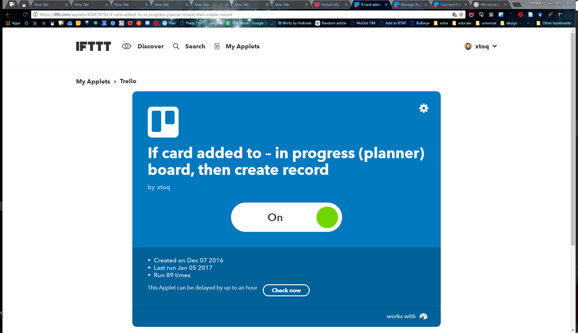
Manage Applets Page
On the “Manage Applets” page (Home Page > My Applets), the header is 202px tall on a 1920×1080 monitor, and the tabs for switching between Applets and Activity are 81px tall. This is 40% of the header area’s vertical space, and each tab takes up 50% of the horizontal space. If we follow Fitts’s Law, this means these actions – Applets and Activity – are the most important actions on this page, and “Applets” is probably rarely used as link since by navigating to this page you’re already on this “link”. That means you’re wasting 50% of the horizontal space and 40% of the vertical space with an action that is only used when someone is on the activity tab.
In addition, the “New Applet” button is on the right side of the page and on the 3rd “level” of visual hierarchy, which makes it difficult to spot. Since most Western audiences interact with websites in an F-pattern, the top left of a website is the place where the most important information or actions should be placed [4]. While this action is probably not more important than managing current applets, it’s certainly as important as Activity and could be afforded the same level of importance. Adding “New Applet” as another “tab” or adding it as an option in the main menu as a user affordance would help users locate and complete this action more quickly [2].
When one has no applets and lands on the “Manage Applets” page, I would expect that creating a new applet would be the most important action. However, the “Get Started” button is the largest and most colorful item on this page, inviting me to click it. But when I do, instead of creating a new applet, I’m taken right back to the Discover Applets page. This makes it seem like the most desired user goal is to use an already created applet, not to create your own. Perhaps that is the case, but it’s certainly feels like a step backwards from the user goals of the old IFTTT.
Services Page and Filter Applets Tool
The filter on the Manage Applets page doesn’t filter correctly. For example, if I filter by “Evernote”, the filter page shows me 8 applets (4 enabled, 4 disabled). But if I go to User Name > Services > Evernote, it shows me 13 applets (8 enabled, 5 disabled) and then a link saying that I have 30 applets that use Evernote. After looking at the 30 other applets, it’s clear that behind this link are the applets that include the selected service as an action, while the main service page shows applets with the service as a trigger but this isn’t clear from the UI itself. I recommend utilizing the tab structure from the “Manage Applets” page and use “Trigger” and “Action” as the options (see screenshots below). This would make it easy to switch between the types of applets, while also reinforcing your UI and UX introduced in other areas of the website (Manage Applets).


At first, I thought that the filter page searches only the description of the applet, not the services the applet involves, but that isn’t the case. I have an applet displaying on the services page with the description “codepen rss -> evernote #daily #log”; this applet does not appear on the filter page. I’m not sure what criteria the filter page uses, but it’s kind of useless for someone with a lot of applets like myself.
Activity Page
I’ve always loved the activity log, and I was excited to see what the new one would look like. However, I’m a bit disappointed. I think it looks fine, the information is reverse chronological and easy to parse, but I find I want filtering and other ways of finding the exact information in the log that I want. While I can go to a specific applet and look at it’s log (in a convoluted way), it would be nice to be able to filter and sort the log from this page.
For individual applets, it’s nearly impossible to navigate to the activity log. To view the log you have to click the “Configure” icon then click the “Activity Log” link. Since the URL structure for viewing each applet’s log individually exists, it seems like the filtering options would be a worthwhile thing to look into implementing.
My Account Menu
Clicking on my user name brings an expected interaction – a menu – with an unexpected option: “New Applet.” To be quite honest with you, it wasn’t until I was writing this feedback for you that I even knew there was a “New Applet” option in this menu. It makes no sense that one of the top 3 user goals for IFTTT is hidden in the account menu. (Side note: I really, really liked that the activity log was in the account menu; I felt that this was a good place for this information, easily accessed but not distracting. Now that link is gone for me, even on my new user account. Sad day.)
Applet Details
The applet details page is perhaps the most damning evidence that this mobile-first design was not optimized for desktop. On my 1920×1080 monitor, the details box is 471px wide, which is ~30% of the main content area’s size of 1444px. This means even on this large of a screen and with this little information that is displayed for each applet, I have to scroll down to see all the information. Just changing the main applet card max-width to 50em and the button to 40% makes things more readable on desktop and makes this UI feel customized to desktop, rather than looking “recycled” from mobile (see screenshots below).

As an aside, I love how Zapier has the option to conduct a test of your zap (recipe) and its criteria before turning it on, allowing you to fine-tune tricky things like the Maker channel or RSS feeds. It would be great to have some way to test applets within IFTTT.
Summary
- The redesign doesn’t seem optimized for desktop, but rather ported over from mobile.
- Progressively enhancing the design to take advantage of the communication channel’s information capacity is the best option.
- Changing the terminology from recipes to applets without some onboarding can leave current or returning users confused, and the lack of context or onboarding after creating a new account doesn’t help new users acclimate to the app or the services it provides.
- New UX patterns established with the redesign aren’t reinforced elsewhere in the application, making the experience feel staggered, and sometimes making me question whether I as a user had made a mistake.
- Critical user goals seem to change from page to page, and the most important user goal on each page is not necessarily the most obvious one.
- The redesign has increased the interaction cost of the most important user goals of IFTTT: creating and managing applets.
References
[1] Homepage Real Estate Allocation
[2] The Design of Everyday Things: Revised and Expanded Edition – Don Norman
[3] Mobile First Is NOT Mobile Only
[4] F-Shaped Pattern For Reading Web Content