It’s my fourth wedding anniversary and I made this little “card” for my husband Spydir. He loves coffee, I love puns, seemed appropriate!
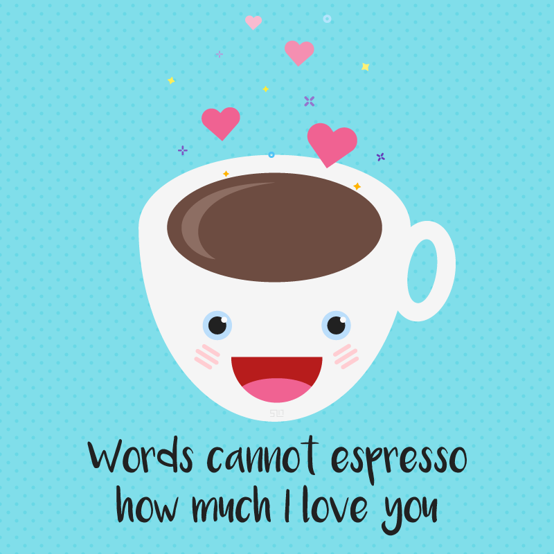
It’s my fourth wedding anniversary and I made this little “card” for my husband Spydir. He loves coffee, I love puns, seemed appropriate!
Jessica Rabbit via my Instagram because I’m too lazy to upload it here.
via IFTTT
NOTE: This is some user feedback I recently sent to IFTTT‘s CEO per his request on Product Hunt. I love their service, I just wanted to point out some places that this redesign might have missed the mark. Despite these niggles, their redesign was much needed and I believe quite successful, these are just some suggestions of how it could be even MORE successful. If you’ve never used their service, I highly recommend it.
The redesign looks nice, but seems like mobile-first has translated into mobile only. What I mean by this is that some designers labor under the false impression that “simple is better” and that a design that works on mobile will be suitable for desktop. The problem is that the condensed and simple nature of a mobile design doesn’t translate well to desktop, and can often decrease usability of the desktop site [3]. In fact, Nielsen Norman Group estimates that less than 40% of desktop screen size is utilized (and that was in 2013!) in modern website design [1]. They talk extensively about the content-to-chrome ratio, or the ratio between website content and UI options (chrome), in this article which is a fantastic read even for non-designers. Stupid statistics aside, some of the “largeness” of the home page and other pages, including header and navigation, screams “not optimized for desktop” to me. Also the usage of “Tap for [action]” instead of “Click” just reinforces the idea.
After logging in or signing up, the first thing a user is presented with is the applet discover page. For new or returning users, you are making the assumption that they read the home page and understand what applets are, or that they are familiar with your service already. This might be a fine assumption to make for new users depending on your signup funnel, but after a UX redesign not explaining the changes or what the terminology means to existing users is a misstep. Even new users might sign up assuming there will be onboarding or other startup documentation, and be left a bit in the lurch when landing on this page. I recommend providing some sort of onboarding with some definitions of terminology or even provide a default applet (perhaps notifying users of new blog posts on IFTT?) for users to play with.


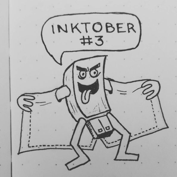


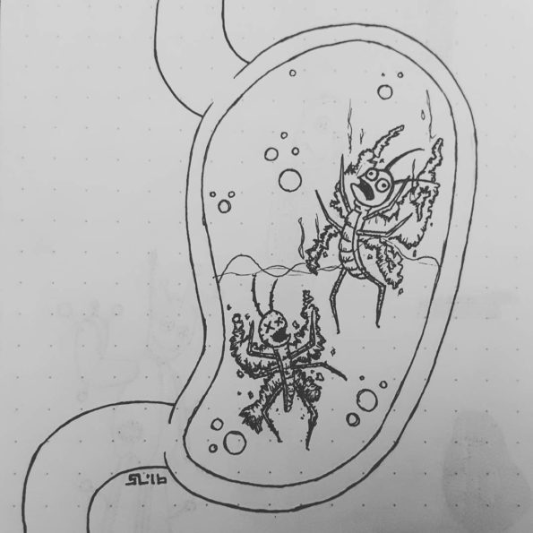
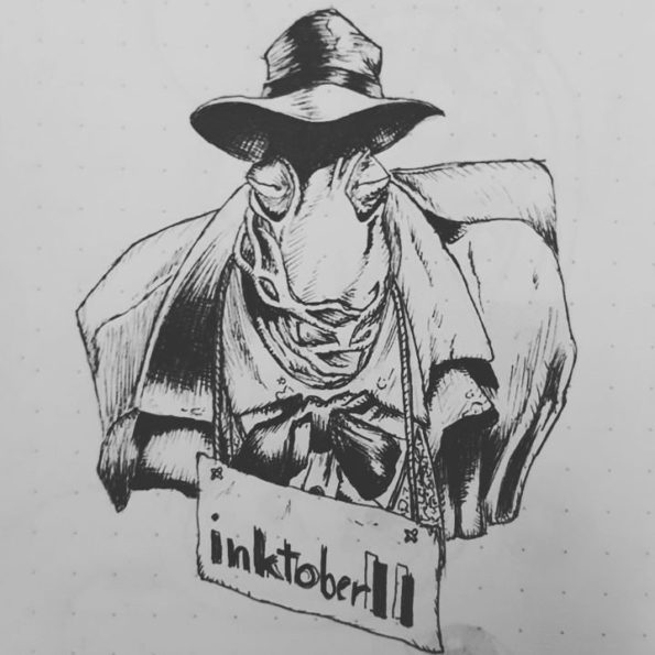

Just a weird little concept I came up with while trying to brainstorm another concept. It’s odd enough I doubt it will be used anywhere else…
Helene owns a condo in South Carolina called Helene’s Retreat. She needed a single color logo for branding and print design. The logo would convey relaxation and the seaside, complete with a more hand-lettered font. I did a lot of iterations for her so we could nail down exactly the perfect logo.
Just some personal logos I’ve been working on. Popular vote goes for the blocky version, but I’m really attached to the origami one.
Just a little thing I made in honor of the Overwatch Winter Wonderland special event going on now! Go play, it’s great.

Finally finished the profile picture for my husband, Spydir. He wanted himself in the style of Rick and Morty. He got his wish!